What is covered in this article?
- What is the difference between the Dashboard tab and Analytics tab?
- Filter dropdown lists
- Other filter actions
- Reset filter
- Dynamic legend
- Bar graph to pie chart
- Special actions for "Funnel Metrics"
What is the difference between the Dashboard tab and Analytics tab?
You can think of the Dashboard as your homepage within SchoolMint Connect. The full collection of SchoolMint Connect data visuals can be found under the Analytics tab. But the Dashboard tab is like your highlight reel. The actions described in this article can be applicable in both locations.
See here for information on customizing your Dashboard.
Filter dropdown lists
Many of the reports under the Analytics tab include an option to filter your data based on one or more parameters including Starting Year or Grade Level. Many of the filters will allow you to choose multiple options (e.g. For Grade Level, you could select one grade, several grades, or all grades from the dropdown list).

Example data sets: Demographics, Funnel Metrics, Totals by Stage, etc.
Other filter actions
Under Analytics > Events, the reports "Key attendee statistics for events conducted" and "Student Statistics by Starting Year" can be filtered using a radio button.

The "Event Summary" report can be filtered using a checkbox to hide events whose dates have passed.

Reset filter
Many of the reports include a button for "Reset Filter". This button returns a filter to its default settings.

This feature is useful because the SchoolMint Connect site is designed to remember filter settings. So if you use a filter and navigate away from the page, when you come back to the page, you will see the filter options just as you left them. Simply navigating away from a page or refreshing a page does not set data filters back to the default. So, a button has been included specifically for the reset action.
Example data sets: Demographics, Funnel Metrics, Totals by Stage, etc.
Dynamic legend
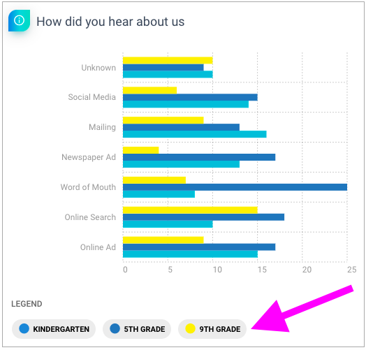
The dynamic legend feature allows you to click to view a list of students in a given category. For example, if you clicked on the "9th Grade" option below, the site would show you a list of 9th grade students who fit the given parameters.

Example data sets: Demographics, By Location, How Did You Hear About Us, etc.
Bar graph to pie chart
Under Analytics > Research, the reports "How did you hear about us" and "Lead Source" can be viewed either as bar graphs or as pie charts. Use the button shown here to click between the options.

Special actions for "Funnel Metrics"
Under Analytics > Inquires, the report "Funnel Metrics" has a few special actions.

The "Copy Chart" button allows you to copy the Funnel Metrics chart. From there you can easily paste the chart into a slide deck or other document. This can be a helpful tool for internal reporting.
Under the button showing three lines, there are several options.
- "Aggregate Charts" allows you to collapse the grade-level funnels into one funnel. This is helpful if you are interested in total numbers rather than numbers that are broken out by grade level.
- "Download PDF" allows you to download a PDF file showing the Funnel Metrics chart.
- "Download CSV" and "Download XLS" allow you to download spreadsheets of the Funnel Metrics data.
- "Print Chart" allows you to quickly print the chart image.
Still have questions? Click here to submit a request for further assistance.
Comments
0 comments
Article is closed for comments.